Label Packaging Design Templates: 12 Examples That Sell
Author: Glancy3D Team | Date: May 21, 2026 | Reading Time: 5 min read
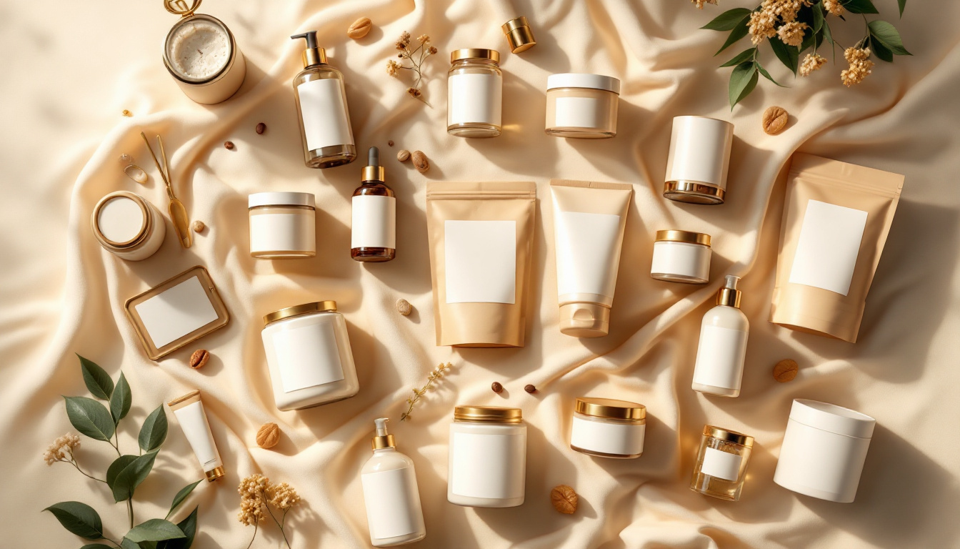
TL;DR: A good label packaging design template gives you a proven layout to start from, so you spend your energy on the product story rather than the grid. Below are 12 template directions that consistently sell across categories — plus how to adapt one without ending up looking like everyone else.
Starting a label from a blank canvas is the slowest way to design one. Templates fix the hard structural decisions — margins, hierarchy, where the eye lands — so you can focus on what makes your product different. Here are twelve directions that earn their place on a shelf, each suited to a particular category and shopper.
12 label templates that consistently sell
1. Minimalist mono. One colour, lots of white space, a single bold wordmark. Reads as premium and modern — strong for skincare and supplements.
2. Bold typographic. Oversized type as the hero. Cuts through a busy shelf and photographs well at thumbnail size.
3. Heritage / vintage. Crests, serif type, muted palette. Signals craft and tradition — works for spirits, coffee, and condiments.
4. Eco kraft. Uncoated paper look, earthy tones, hand-drawn marks. Communicates natural and sustainable at a glance.
5. Pastel beauty. Soft gradients and gentle serifs. The default visual language of modern personal care.
6. Clinical / clean. White, sans-serif, precise spacing. Reads as effective and trustworthy for health and OTC.
7. Vibrant flat colour. Saturated blocks and playful shapes. High energy for snacks, drinks, and youth brands.
8. Illustrated narrative. A custom illustration that tells the origin story. Builds an emotional, gift-worthy feel.
9. Transparent / no-label look. Clear substrate with minimal print so the product shows through. Honest and contemporary for beverages and oils.
10. Monochrome luxe. Black, gold or silver foil, tight kerning. The shorthand for premium across nearly every category.
11. Retro pop. Seventies palettes, rounded type, nostalgic motifs. Memorable and shareable for challenger brands.
12. Data-forward. Ingredients, doses, or specs presented as the design. Wins with informed shoppers in supplements and functional food.
How to adapt a template without looking generic
A template is a starting grid, not a finish line. Change one thing that is unmistakably yours — a custom wordmark, a signature colour, a proprietary icon — and keep the rest disciplined. Then pressure-test it: preview the label on the real 3D container, shrink it to a marketplace thumbnail, and stand back two metres. If it still reads and still feels like you, the template has done its job.
Try a template on your own packaging
The fastest way to know whether a direction works is to see it on your actual container, not a flat mockup. Try Glancy3D for free, apply any of these directions to a 3D package, and compare them side by side before you commit.